COMMUNITY & CREATIVITY
Connecting the dots
Client: Human-Hotel | Type: Concept, Branding & Identity, Digital Design | Year: 2018 | Agency: Trouble
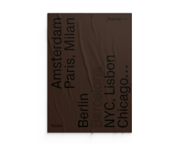
Human-Hotel is a homesharing community on a mission to create meaningful meetings by connecting creative people with local hosts throughout the world. It’s a catalyst for new creations; what makes strangers meet to share experiences and new ideas. In its essence, it’s the result of people meeting — it’s humans and it’s connections.
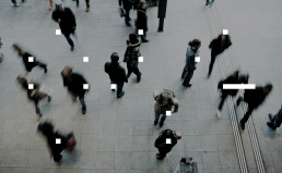
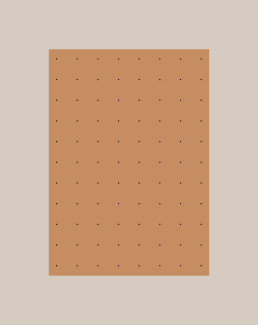
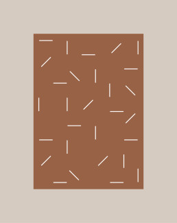
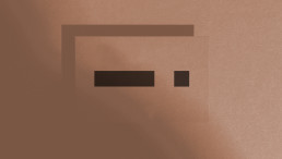
We created fundamental brand elements that represent that idea: the dot as the representation of the human, and the dash as the representation of the connection.
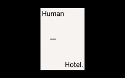
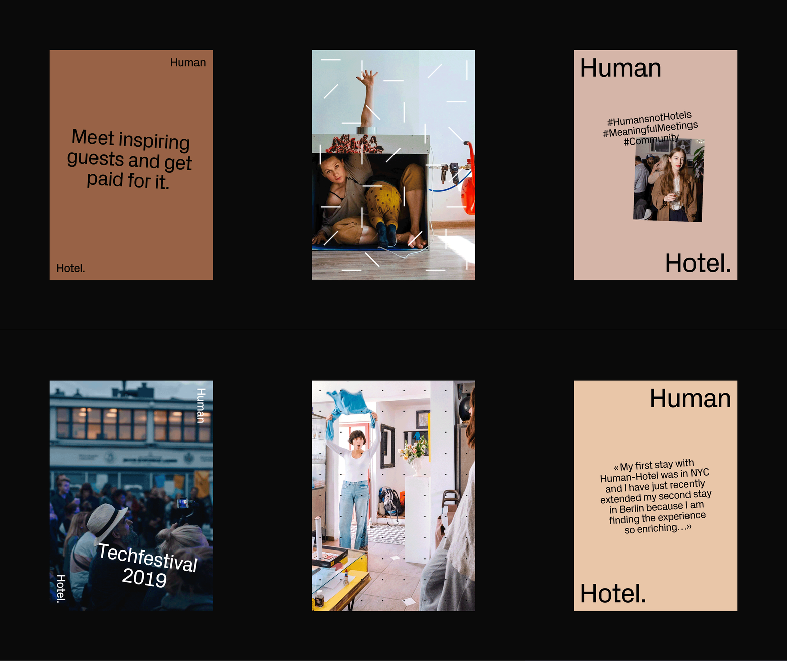
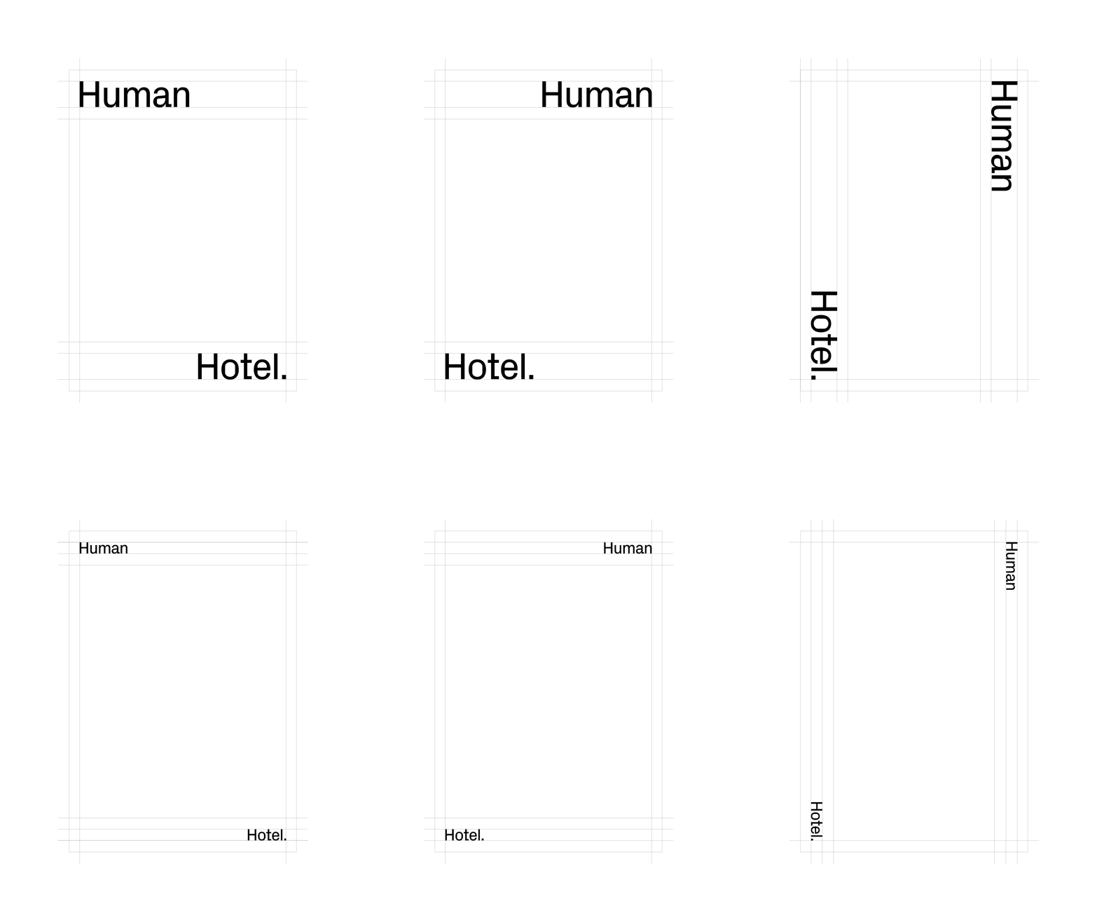
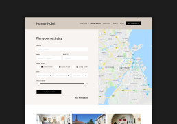
On our layouts, we visualize Human Hotel as a black frame that hosts, supports and empowers the content, and its users. The space inside the frame Human Hotel should be seen as a playground. The frame is structured to let the real content – the experience shine, without taking over. But in between, the language is playful, more organic, alive and vibrant. It’s Human.
This playground provides endless possibilities that can speak to every kind of audience and show all sort of experience, from the sweetest to the craziest one.
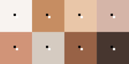
The color palette: A chromatic inventory of all humankind.
These range of human skin tones highlight the culturally diverse community of artists that Human Hotel thrives upon and serves.

